Top 6 industrial interiors that focus on user experience
With establishments finding ways to cut down their fit-out costs, industrial interior design has been the trending go-to theme for the commercial sector.After all, its contemporary look and authenticity is a plus for business owners: research shows that ambiance affects customer perception and brand loyalty when done right.We show you the top 6 innovative industrial, commercial interiors that put user experience front and center.
1. Rivero González Store
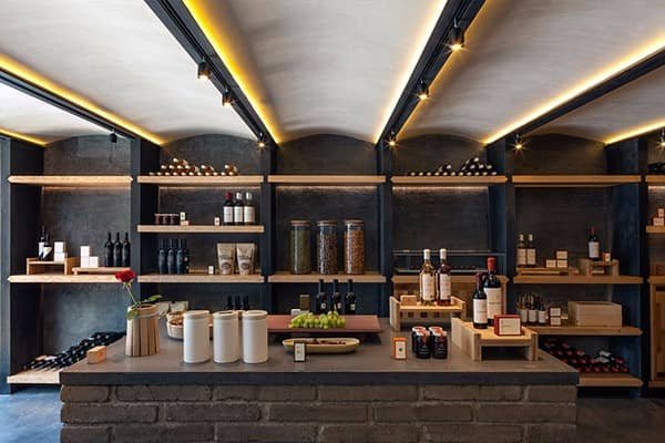 Images via Savvy StudioA family-owned winery in 1998, the Rivero González store originated from the region of Parras, Coahuila in Northeastern Mexico. Since 1598, the area has been the home of the oldest winemakers in the country.The store hired Savvy Studio to design their first store in Mexico City employing a sleek industrial design in its every corner.Mimicking a wine cellar, Rivero González boasts black modern track lights that extend across the ceiling and down to its charcoal walls. A mixture of polished stone and wood makes up the majority of the interior.
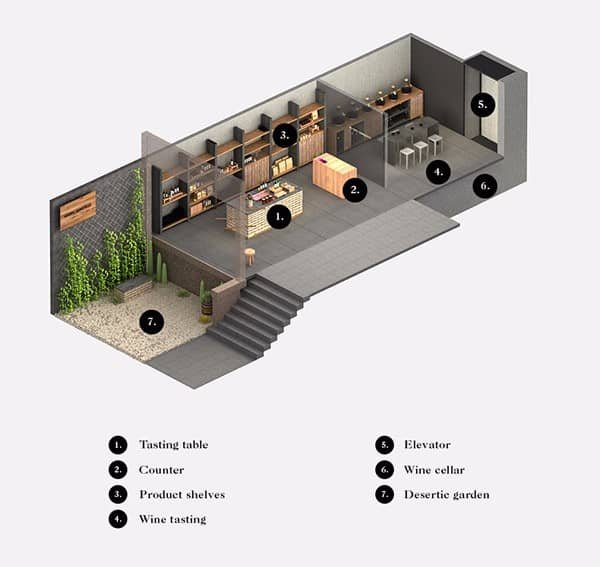
 But the highlight of this industrial beauty is the art on display made explicitly around the concept of viticulture.Everything celebrates the magnificence of wine - from the custom bowls to the decor created from recovered wine barrels.
2. Industrial Kitchen Studio
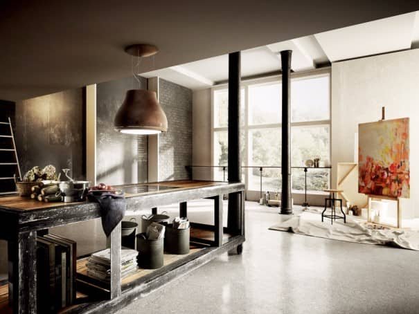 Image via Giuseppe Burgio
 Giuseppe Burgio intended his design to be a dual workspace. He turns an industrial kitchen into two worlds - a rustic kitchen and an airy, well-lit studio.Space can be utilized for workshops and in-house sessions. It can even be turned into a coffee shop with an open kitchen - talk about the possibilities!
3. Rooftop Bar in Sukabumi, Indonesia
 Image via Brian Karno JanDesigned by Brian Karno Jan for Dlux Interior Jakarta, the rooftop bar is located in a hotel in Sukabumi, Indonesia.
 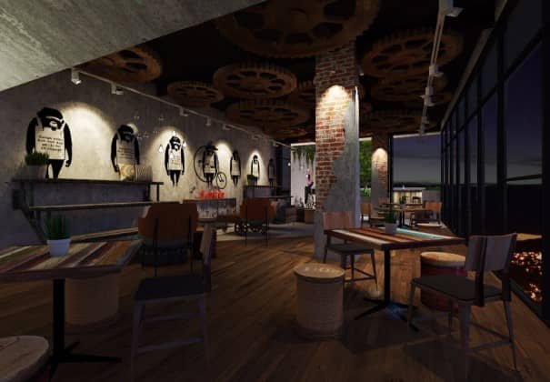 Comprising of brick walls and wooden floorboards, the bar is set to become one of the hippest pit stops in the Sukabumi area.It aims to attract a young, vibrant crowd and to foster a sense of community.
  Patrons can enjoy the open al fresco bar area on the rooftop for a quiet drink or a lively party.
4. Yelp
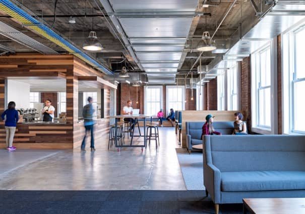
 Image via Studio O+AAfter Yelp moved from its small location in San Francisco to a tower in the financial district, the company commissioned Studio O+A to design its brand new office.The idea was to create a cohesive workspace tied to a common goal: to build creative and dynamic interaction within the company.
  This proved to be a challenge for Studio O+A, so they placed communal destinations that appeal to staff on all floors.There’s a fully-functional coffee shop on the 8th floor, a break room with seating on the 5th and recreational areas with semi-private pods on the 11th.

5. The Little General Espresso Bar
 Image via Clelia Dal ColA charming cafe in Sydney Inner West, Clelia Dal Col designed this quaint hole-in-the-wall coffee shop as one entity when in fact, it started as two adjoined commercial spaces.
  With its industrial shell, the Little General Espresso Bar shows it has a natural affinity for raw materials.The exposed ceiling beams make you feel like you’ve walked into a warehouse rather than a cafe.
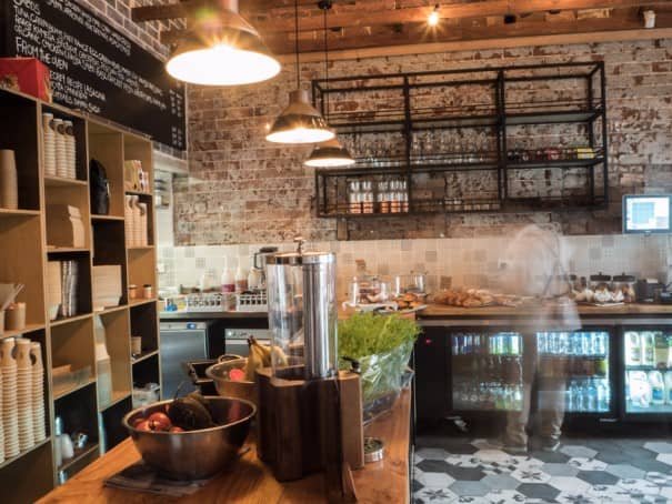 In spite of the stark elements like concrete and steel, the introduction of warm wood and exposed brickwork create a beautiful, cozy space.

6. RetroSuperFuture
Banking on simplicity and user-brand experience, RetroSuperFuture’s LA store is another innovative brainchild of Savvy Studio.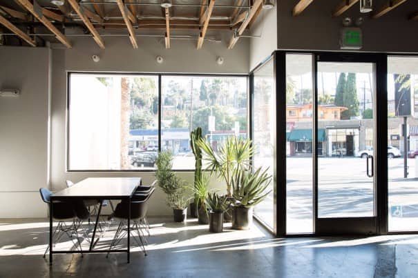 Images via Savvy StudioThe optical store’s main theme revolves around simple materials, clean lines, vegetation, and a monochromatic palette.
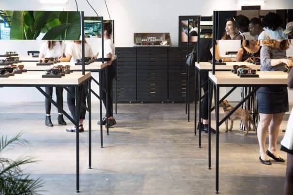 These elements were chosen so that the products could be tested.To give each customer the ability to try the lenses on with some privacy, Savvy Studio also introduced eye-level mirrors for each display unit.
  By keeping it basic, RetroSuperFuture emphasizes that their story and prestige are on their lenses and that the buying decision is much easier when there’s nothing to look at but the product.
